A challenging aspect of modern cytometry is in how we deal with ever-increasing numbers of measurements and markers. New instruments provide us with more colors so that we can learn more about the cells we analyze. Traditional analysis strategies with 2P plots and gates become tedious, if not impossible - there are just too many combinations of markers to consider. This is not a problem unique to cytometry data, and several methods have been proposed which do a pretty good job of addressing the challenges of high-dimensional data.
In 2008, Laurens van der Maaten and G.E. Hinton proposed a method for visualizing high-dimensional data called t-SNE . The name means "t-Distributed Stochastic Neighbor Embedding", and the method does a great job of reducing dimensionality to 2 or 3 dimensions. At the same time, the commonality of similar data points is preserved, making it a great tool for cytometry data. You can read more about this method on van der Maaten's web site: lvdmaaten.github.io/tsne.
Verity Software House introduced a significant new dimensionality reduction algorithm derived from t-SNE called Cen-se' in 2019 (Bagwell, et al, Improving the t-SNE Algorithms for Cytometry and Other Technologies: Cen-Se′ Mapping). Cen-se′ (Cauchy Enhanced Nearest-neighbor Stochastic Embedding) corrects several issues with the t-SNE routine and provides better resolution of populations, along with greatly enhanced performance.
WinList has integrated t-SNE and Cen-se' algorithms as calculated parameters, making it easy to generate these plots and explore your data. Let's take a look at how to do this with an example file acquired on a Fluidigm Helios instrument with 48 measurements.
Before you begin, make sure you understand the basics of working with WinList. The tutorial WinList Basics is a great place to start.
Open the FCS file
1. Click the Open FCS button on the ribbon bar and navigate to the Samples folder located in the folder where WinList is installed. Select Helios1.fcs from the list and click Open.
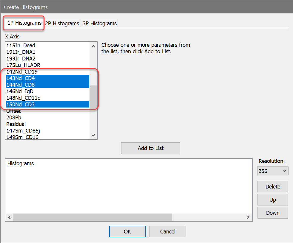
2. In the Create Histograms dialog, switch to the 1P Histograms tab and select the CD4, CD8, and CD3 measurements. The full names for these are 143Nd_CD4, 144Nd_CD8, and 150Nd_CD3. With these selected, click OK.
Create the Cen-se' and t-SNE parameters
Next, we want to create the Cen-se' and t-SNE calculated parameters. To do this, we use the Add Parameter feature of WinList.
3. Click the Add Parameter button on the main ribbon bar. Alternatively, you can right-click in the data source and choose Add Parameter from the context menu.

4. Click the Add button in the Edit Calculated Parameters dialog to add a new parameter.
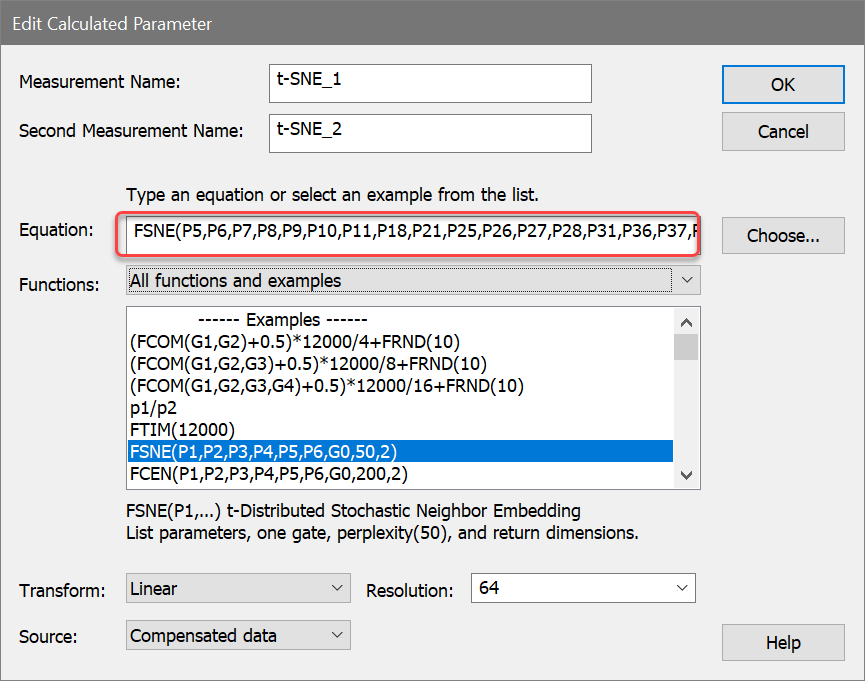
Let's choose an example equation from the Functions list box. The function we're looking for is actually FSNE as opposed to t-SNE. All WinList function names start with the letter F and have a total of 4 letters, so t-SNE becomes FSNE.
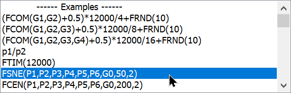
5. Select FSNE(P1,P2,P3,P4,P5,P6,G0,50,2) from the list of example equations. This will get us started.
The function has 3 important parts to it. The first part is the list of parameters that we want t-SNE to evaluate. This can be any number of parameters, starting with P1, separated by commas:
FSNE(P1,P2,P3,P4,P5,P6,G0,50,2)
After the parameters, there is a gate number in the expression. This gate is used to filter the events that t-SNE evaluates. For example, you might have a gate the selects lymphocytes that you want to filter the events on. For no gate, we enter G0.
FSNE(P1,P2,P3,P4,P5,P6,G0,50,2)
You probably will not edit the last two arguments to the FSNE function. They relate to "perplexity" and the number of dimensions to return. Perplexity sets the number of effective nearest neighbors, which has a default value of 50. The number of return dimensions should be 2.
FSNE(P1,P2,P3,P4,P5,P6,G0,50,2)
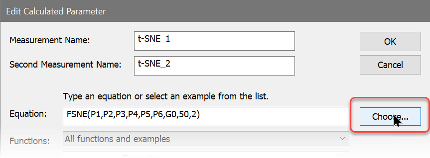
Let's edit the example equation so that it suits our data file. This is easy to do with the Choose button that appears next to the Equation edit box.
6. Click the Choose button.
The Select t-SNE Parameters dialog is displayed, showing two lists of parameters. The Available list on the left contains parameters we have not included, and the Selected list on the right contains those that we have added. To move an item from one list to the other, you simply click the item.
7. Remove P1, P2, P3, and P4 from the Selected list by clicking each one.
8. In the Available list, click p7, p8, p9, p10, p11, p18, p21, p25, p26, p27, p28, p31, p36, p37, p38, p46, and p47 to add them to the Selected list. The dialog will look something like this when you are finished.
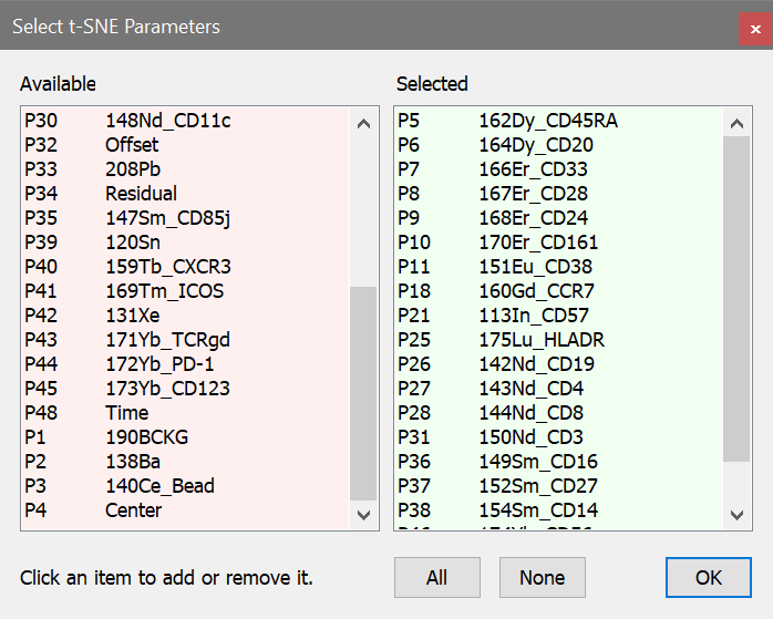
9. Click OK to close the dialog.
The Equation field in Edit Calculated Parameter will now contain this expression:
FSNE(p5,p6,p7,p8,p9,p10,p11,p18,p21,p25,p26,p27,p28,p31,p36,p37,p38,p46,p47,G0,50,2)
We are passing 19 ungated measurements to t-SNE and getting 2 dimensions in return. The measurements are CD45RA, CD20, CD33, CD28, CD24, CD161, CD38, CCR7, CD57, HLADR, CD19, CD4, CD8, CD3, CD16, CD27, CD14, CD56, and CD25. We will leave the gate at G0, and perplexity and dimensions at 50 and 2, respectively.
10. Click OK to closed the Edit Calculated Parameter dialog.
Next, we'll use the same process to add Cen-se'.
11. In Edit Calculated Parameters dialog, click the Add button again to add another parameter.
This time the function we're looking for is FCEN for the Cen-se' algorithm.
12. Select FCEN(P1,P2,P3,P4,P5,P6,G0,200,2) from the list of example equations.
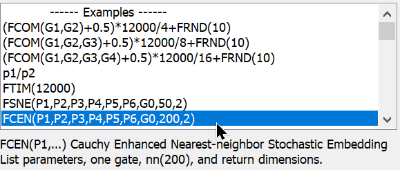
The function is almost identical to the FSNE function. It starts with a list of parameters and then a gate. Next is the number of nearest neighbors, which is 200 by default. The last argument is always set to 2.
13. Click the Choose button. We'll select the same measurements that we used for the FSNE function.
14. Remove P1, P2, P3, and P4 from the Selected list by clicking each one.
15. In the Available list, click p7, p8, p9, p10, p11, p18, p21, p25, p26, p27, p28, p31, p36, p37, p38, p46, and p47 to add them to the Selected list.
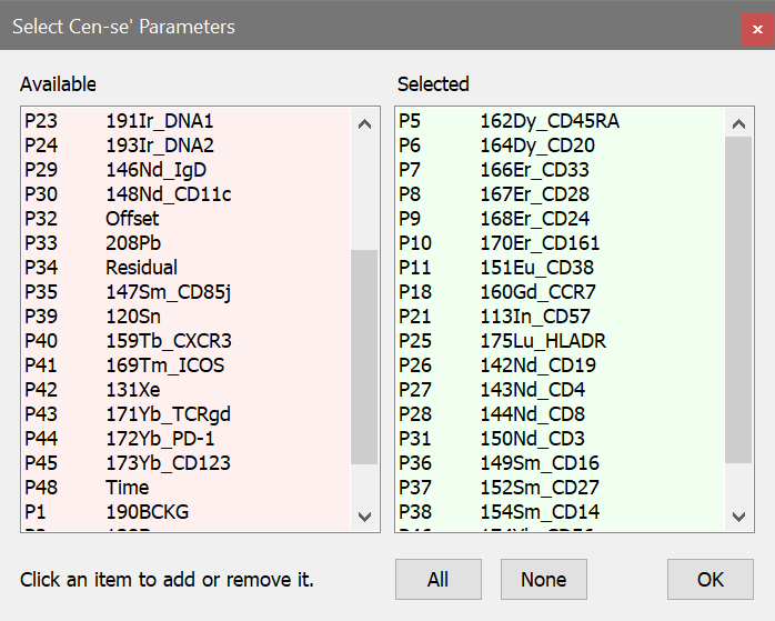
16. Click OK to close the dialog.
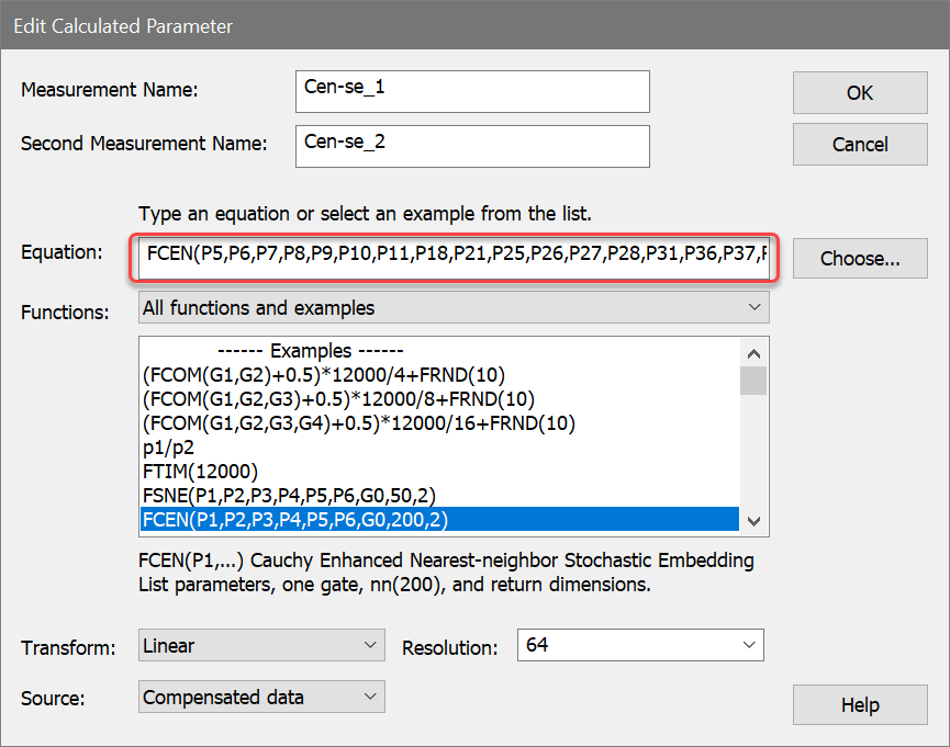
The Equation field in Edit Calculated Parameter will now contain this expression:
FCEN(p5,p6,p7,p8,p9,p10,p11,p18,p21,p25,p26,p27,p28,p31,p36,p37,p38,p46,p47,G0,200,2)
17. Click OK in the Edit Calculated Parameter dialog. We now have two new calculated parameters.
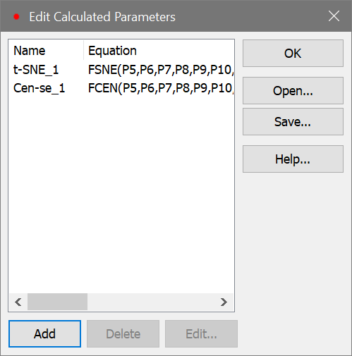
18. Click OK in the Edit Calculated Parameters dialog.
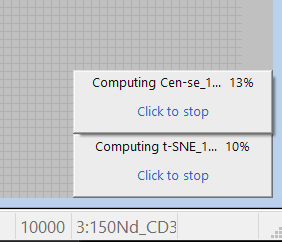
The program will begin to calculate the new parameters. Depending on your computer, this might take a few moments to a few minutes.
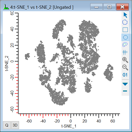
Let's create 2P plots that will display the Cen-se' and t-SNE parameters.
19. On the Insert tab of the ribbon bar, click the Dots button to add a dot plot to our layout. Move it and size it to your liking. You may want to increase the Dot size to 5 and change Dot order to Low frequency on top in the Edit Graphics dialog. These settings are helpful for t-SNE plots.
20. Change the X-axis to display t-SNE_1 and the Y-axis to show t-SNE_2.
When the t-SNE function finishes computing, you should see a plot similar to this:
21. Right-click in the new t-SNE plot and choose Clone from the context menu.
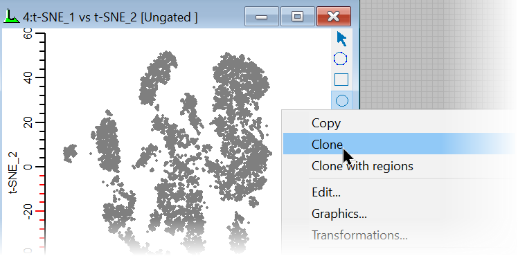
This creates a copy of the t-SNE plot, which we can modify to show the Cen-se' measurements.
22. Change the X-axis to display Cen-se_1 and the Y-axis to show Cen-se_2.
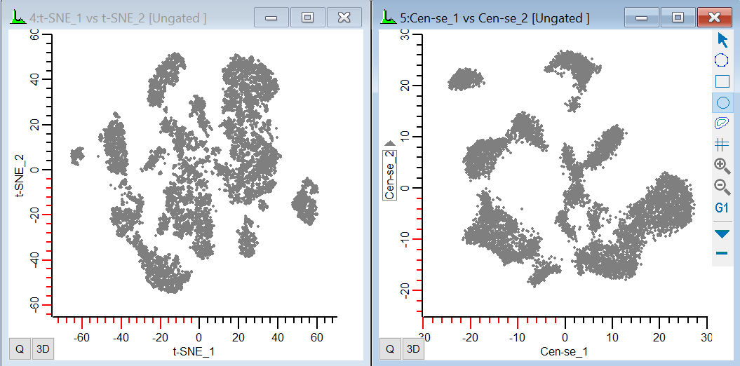
In both plots, we can see some distinct groups of events and some continuous distributions, but we have no idea what they mean. How does this help us understand our data? Well, it's always useful to start with something we know. Let's see where the CD3, CD4, and CD8 cells are in this plot.
Using other plots to understand Cen-se' and t-SNE
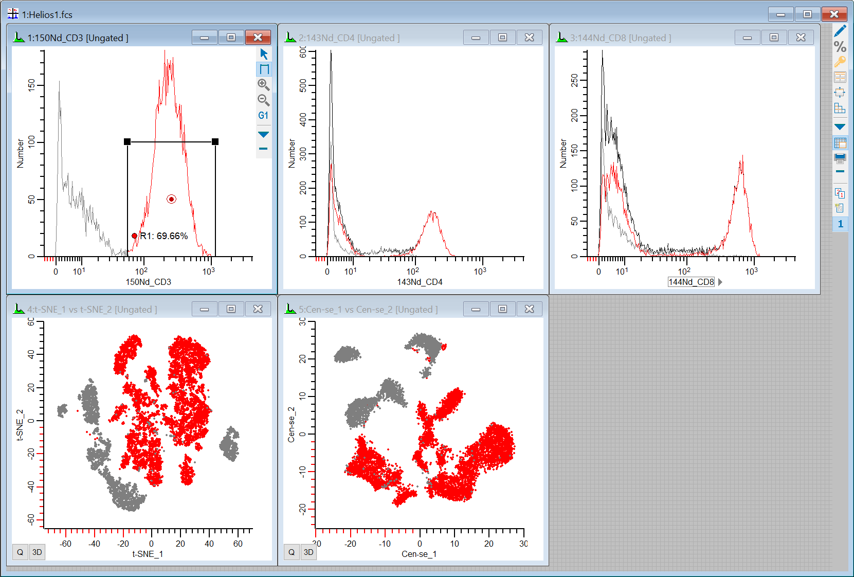
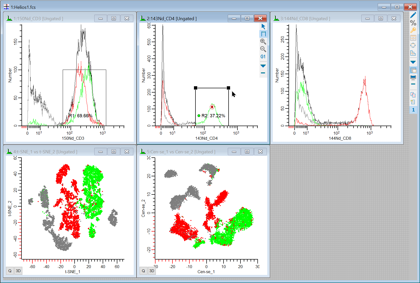
Our workspace has 5 plots on it: 1P plots for CD3, CD4, and CD8, and 2P plots for t-SNE and Cen-se'. Let's put some regions on the 1P plots to see where the positives are the 2P plots.
23. Draw a region on the CD3 positive events in the 1P plot, and observe where they fall in the t-SNE and Cen-se' plots.
24. Draw a region on the CD4 positive events in the 1P plot and notice where they are in the t-SNE and Cen-se'.
25. Draw region on the CD8 positive events. This should account for most of the remaining portion of the CD3 events in t-SNE and Cen-se' plots.
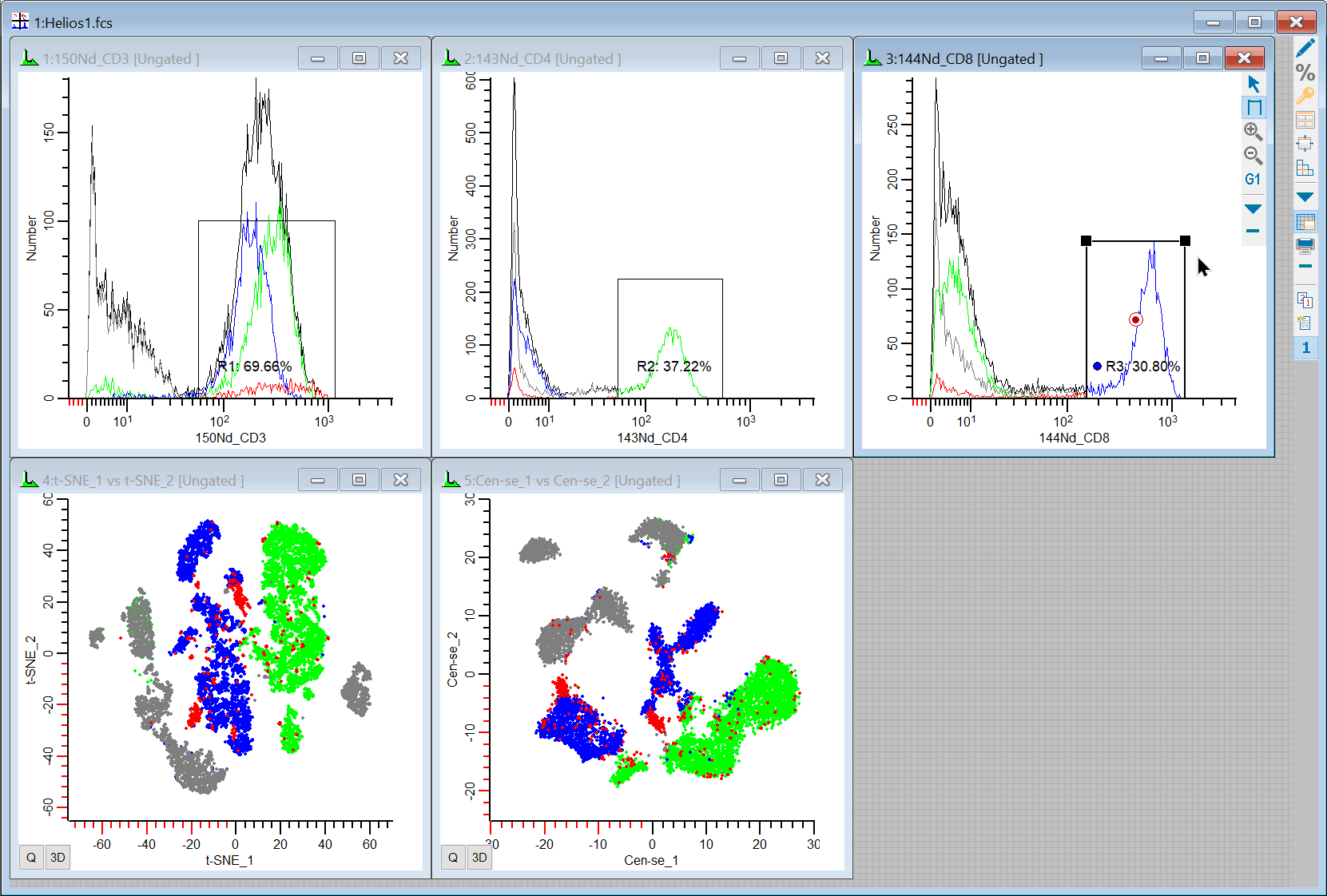
So we can see event coloring and gating in t-SNE and Cen-se' and figure out what the different populations relate to. Since these plots can change shape and location from file to file, this is always a good way to get started. It provides a backbone of information to help relate the plots to what we know about our data.
Using Cen-se' and t-SNE to understand other plots
The most exciting part of t-SNE and Cen-se' is that they reveal populations detected in multi-dimensional space. What can we learn if we draw a region around one of those populations? Let's find out.
26. On the Insert tab of the ribbon, click the Multiple button to display the Create Histograms dialog. Add 2P histograms for these markers:
164Dy_CD20 vs 142Nd_CD19
162Dy_CD45RA vs 175Lu_HLADR
154Sm_CD14 vs 166Er_CD33
149Sm_CD16 vs 174Yb_CD56
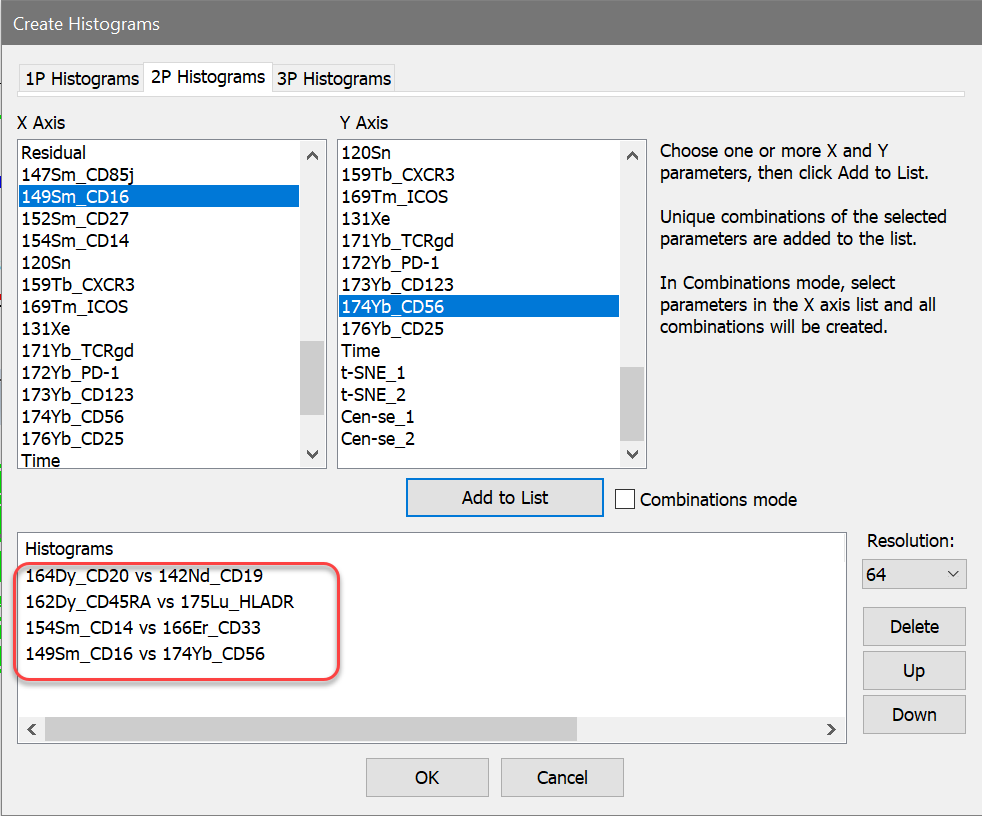
27. Click OK to create the histograms. Arrange the histograms to your liking.
We'll use the Cen-se' plot to explore the additional populations.
28. Draw a region on the Cen-se' plot around the population in the left top of the plot.
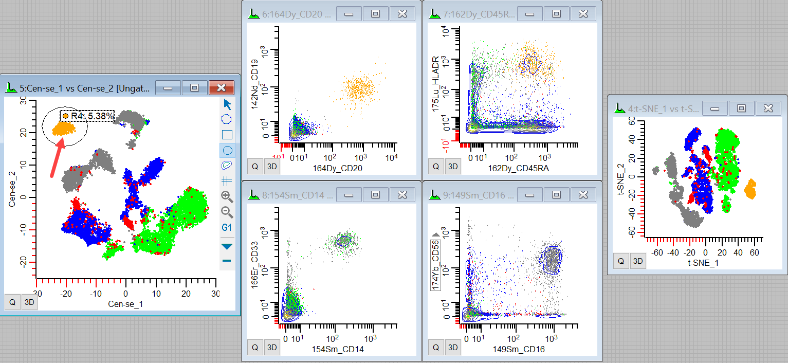
The events that light up are CD20+ CD19+ CD45RA+ and HLADR+. They are probably mature B-cells. We can also see where they fall in the t-SNE plot.
29. Move or redraw the region over the population in the top center.
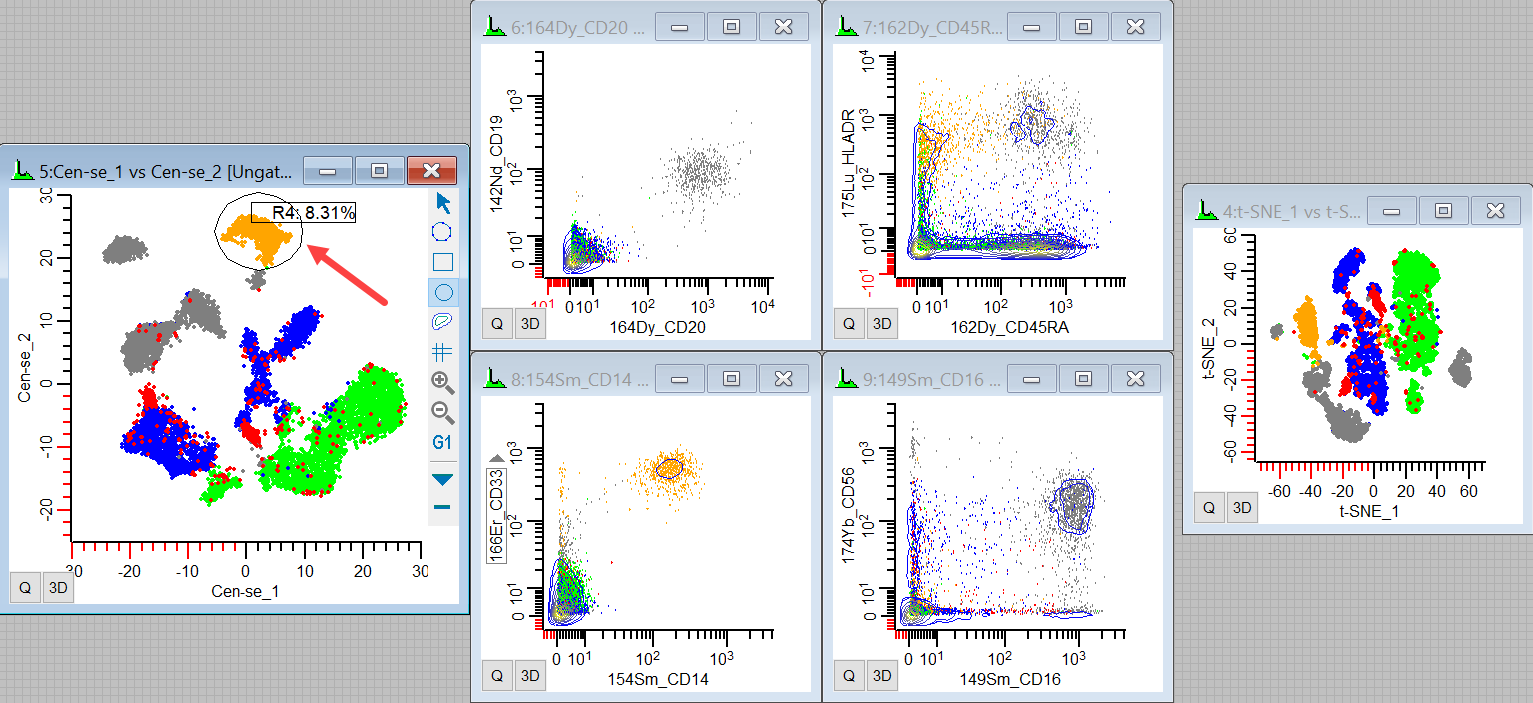
We see the CD14+ CD33+ HLADR+ events light up, making these likely to be monocytes.
30. Finally, redraw the region around the remaining large distribution on the plot.
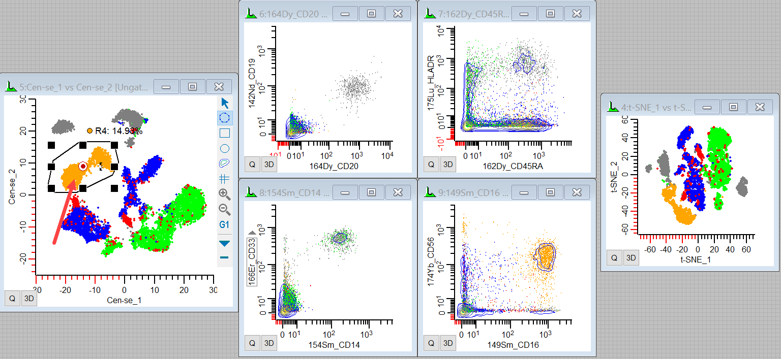
These are probably NK cells, as they are CD16+ CD56+ CD45RA+.
If you want to see the region events more dramatically in the other plots, you can right-click the region label and choose Highlight events in R4.
We're only displaying a few histograms in this tutorial to make the point, but you can see the power of the t-SNE and Cen-se' functions. They are good at finding related events and allowing us to see what they have in common by looking at the markers in our sample. As you probe the islands of events in Cen-se and t-SNE plots and see where they fall in other plots, you'll find some surprises and confirm some things that you already know.
Summary
WinList includes powerful Cen-se and t-SNE functions that take high-dimensional data and flattens it into 2-dimensional space so that it can be visualized in conventional 2P plots. Cen-se' is computed using the FCEN calculated parameter, and FSNE is WinList's implementation of t-SNE. You can display the measurements created by the functions as 2P plots that work just like any other 2P plots.